3D printed wireless charger
Designing a wireless charging pad
I bought a new car. However, due to the chip shortage, several things were missing. One of those features was a wireless charging pad. I'll explain how I designed and 3D printed my charging pad from scratch.
In my previous blog post, I talked about how I got into 3D printing and upgraded my 3D printer with a webcam and remote access. Since then, I've been using it for many 3D prints that I downloaded from Printables.com or Thingiverse.com.
My 3D printer: Prusa i3 MK3S+However, I mainly purchased a 3D printer to print my designs, and I also had to learn CAD software to create a custom design. But first, what could I design? Or rather, what could I design to solve a problem of mine?
After 3 months of waiting, my new car was delivered. And as with all vehicles, a few things were missing due to the chip shortage. One of them is a Wireless Charger station. Most cars have a dedicated storage section where you can put your phone for wireless charging. And because most new vehicles also have Wireless CarPlay, it's really convenient.
Luckily, the center console (the only place I could put a phone) had 2 USB-C ports. So, that's something we're going to use.
The center console has two USB-C portsSo, I decided to design and 3D print a custom "MagSafe Charger" station tailored for my car's center console. I'm using an iPhone 12 Pro, which supports MagSafe Charger. I could, of course, start using the USB-C port from day one with my MagSafe Charger. But it wasn't user-friendly, it was a hassle to put the phone down and grab it again, and the center console was a total mess due to the cable intermingle.
Tools and gear I used
For prototyping, I used the following devices and tools:
- Apple iPad Pro 12.9-inch Pro: For general research, CAD, sketching, everything that comes to mind. I just love this device.
- Prusa i3 MK3S+ 3D Printer: If you have read my previous blog post, I'll explain more about my 3D printer.
- Mitutoyo Digital Caliper: To design a 3D model, we need to know precisely every measurement in all three axes. I've used the caliper to measure the center console dimensions, cable widths, MagSafe accessory details, and many other minor things.
- Plier: To take out the supports from my 3D model. 3D models sometimes have "supports". These are additionally printed to support overhanging details (because a 3D printer can't print in the air). Once a print is finished, we have to remove the supports manually.
I only used the following software:
- Shapr3D: a CAD software specially made for the iPad. All my designs in this blog post are created using Shapr3D.
- Prusa Slicer: The official Slicer software for turning my 3D models into G-Code files, so the 3D printer knows how to print a 3D model.
- Apple Notes: for quick sketches, notes, and gathering/collecting information (such as Apple's official MagSafe accessories PDF)
Let's start!
First iteration - The block
The first iteration was pretty basic.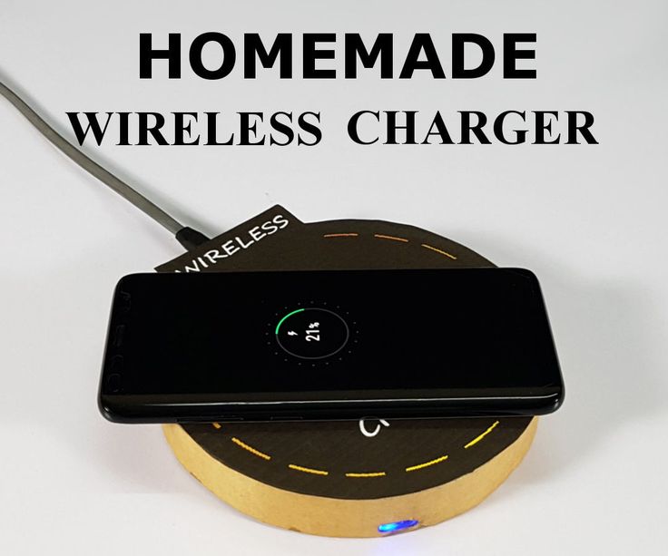 A diagonal block with a place to insert a MagSafe Charger pad. It wasn't pretty, but I thought I wouldn't need such a thing. After printing, it tried to put it inside the center console.
As you see, the length wasn't a 100% perfect fit. And also, I was using Shapr3D's free offering; hence my design was exported in a low resolution, leading to certain inefficiencies, such as the circle being not a perfect circle. However, that wasn't the main issue here, and the problem was that I had the wrong measurements for the cable insert.
MagSafe charger’s cable doesn’t fitI took a USB-C Apple cable from the drawer and measured the female port section. However, I discovered that the MagSafe Charger's plug was thicker than a standard Apple USB-C cable plug. Not the actual USB-C plug, but the thick housing surrounding the connector. In fact, a lot of USB-C cables have a different connector widths and thicknesses.
A comparison between the different USB-C cablesThere were other issues with this first initial design:
- Placing the phone on the charger and grabbing it would rip off the whole charge station because of the strong magnets.
 I had to hold with one hand the charge station and grab it with another.
 - Because the charge station wasn't a perfect fit when I would stop the car, the model would rattle around.
- The cable would stick out, occasionally preventing placing the phone.
- It was ugly.
Second iteration – Back to the drawing board
I sat down, took my iPad, opened Apple Notes and Shapr3D, and started designing a better iteration. The v2 iteration looks similar to the final iteration, so I believe I nailed it. First, before 3D modeling it via Shapr3D, I thoroughly measured every part of the center console with my caliper. I sketched the rough idea first.
Initial draft sketches of my second iterationAfter the sketch, I started designing it on Shapr3D. I have to say, the more I used Shapr3D, the more I liked it. I like devices (like my iPad) where I can grab and work whenever I have spare time. It's the same reason I use my Nintendo Switch more often than my Xbox. Anyway.
What did I change in this design?
- I change the orientation. It's now fitting the center console vertically, hence perfectly fitting.
- The center console USB-C ports are not visible anymore; hence placing the phone doesn't interfere with anything anymore.
- There is a small cutout on the front to allow a second USB-C cable to be used for charging.
- I fixed the cable hole for the MagSafe's USB-C charger cable.
- It's better looking than my first iteration.
As you see in the photo, this looked much better than the previous. I could easily stop here and call it a day. However, there were a couple of slightly annoying things. First, of the good parts, I was happy because I could quickly put and grab my phone. However, it wasn't a %100 fit. It was slightly loose, not a lot anymore, but still, I could feel it.
A photo of my phone put on the MagSafe charger stationThird iteration – Improvements
I sat down again and started modifying my existing design. I came up with a new design that would incorporate several further improvements:
- A slight edge to stop sliding the phone. Even though the MagSafe magnets are strong, I added a small lip at the border to prevent the phone from wobbling.
- 5 mm wider. This change makes sure that it fits the center console perfectly. Even if I hard-break the car, it doesn't wobble anymore.
- 5 mm longer at the back via a 15 deg slope. This is hard to tell, but the center console is not a square box, and the end of the center console has a slight incline. If you look carefully, you could see the ports in the previous iterations, but you don't see them anymore with this design.
- Cable holder extension to be used with a Zip tie. Even though we don't see the cable anymore, the wires were not tied anywhere. I could now connect the cable with a zip tie with the little wing.
- A hole for the MagSafe insert to take it out easily.
 After working on so many iterations, taking out the MagSafe from the charge station was a hassle. Furthermore, to ensure I can replace it in the future, I put a small hole underneath the MagSafe pad. That way, I can push it from the bottom, and it comes off easily.
 - PETG instead of PLA. The previous iterations were printed with the PLA material; however, it's not the best choice for car accessories because cars can get very hot during the summer (especially where I live). PLA deforms easily in warm environments. PETG, on the other hand, is better suited because it's more tolerant of higher temperatures. (For those who are curious, there is an informative YouTube video where someone experiments with various materials inside a car)
After using this third iteration for a while, I've found some annoying things and inefficiencies in the design. However, printing the 3D models over and over became time-consuming, and printing a single model was around 17-18 hours.
How could I speed up the process?
Fourth iteration – Modular Design
First, what improvements were needed:
Printing the modular version- The charging station would perfectly fit; however, because the center console is not that deep, I also lost quite a bit of space.
 I could use the area underneath the MagSafe charger, which was a hollow space.
 - The small lip I added wasn't helpful; it prevented me from placing and taking out the phone quickly. I wanted to remove it.
- Because the phone would cover the charging pad area, I had to grab it from all sides to take it out. I could make my life much easier if one side was shorter and empty underneath the phone. That way, I could grab the phone directly from the side.
I decided to make it modular because it would take a lot of time to print the model. At least while I am still prototyping the final design.
The modular design would consist of three pieces. Two sides and one middle piece. That way, I could print each part without support. Without supports means that all the time spent printing the supports is no longer needed.
Making the design modular improved the print time from 18 to 10 hours, and it was a game-changer. I could now iterate on the design and spend half the time printing the pieces.
As you see in the photo, this iteration would allow me to put small items underneath the charging station, such as napkins, pens, etc.
Fifth iteration – Hiding the cable canal
When I posted my fourth iteration on Twitter, some of my followers shared a couple of 3D models of MagSafe chargers where the cable canal was hidden from the surface and was tucked underneath the charging station, so it wasn't visible. I dug into this as it was yet another improvement towards a better-looking design.
Because of the modular design approach, I could only work on the middle section and print the center section.
The fifth iteration has now 4 piecesAfter working on hiding the cable canal, I split the centerpiece into two parts. Now the whole model would consist of four pieces.
Comparison between v4 and v5 with the cable canal hiddenAs you see from the photos, the newer version looks cleaner and more straightforward.
Was this the final version, though?
Now that I've used it for prototyping, the modular version was beneficial in many ways. However, creating a modular version isn't easy, as you must ensure the holes and stubs fit perfectly. The accuracy of the stubs is tricky because of 3D printing's current limitations. To keep it short, it wasn't as stable as the one solid piece models.
What if we could wrap the 3D model with a fabric?Now that the design was final, I decided to print it as a single block. While doing it, I also reminded myself that I wanted to wrap it with a fabric to match the interior materials of the car's center console.
Utilities needed for cutting and wrapping the fabricI didn't know what to use, but I somehow stumbled across a seller that would sell fabrics in various colors with a self-adhesive side. That was perfect! It would mean I could just attach the material to my 3D model.
Cutting a perfect circle wasn't easy, but several hours later, I could finally cut a piece of fabric with a hole big enough to accommodate the MagSafe pad.
Here are the photos of the final design, where the whole model is wrapped with fabrics.
Verdict
After numerous iterations, I finally finished the project. Here is a photo of all iterations next to each other:
To ensure I give back to the 3D community, I also decided to share my STL files on Printables.com. If you have an Audi A6/A7 or any Audi car with a similar center console, you can print this design and start using it immediately.
What I liked the most about the process was how someone could get into industrial design with an iPad and a 3D printer. Once you know where to look and have an idea, it's easy to kickstart the whole prototyping process.
If you have read this so far, thank you! You can imagine how great it feels to iterate on a real-world object. I'm pleased about the outcome and using my 3D printer to solve real issues I encountered was just phenomenal.
Pokemon Fan Uses 3D Printer to Make Pikachu Wireless Phone Charger for Their Boss
By Sarah Fields
A Pokemon fan with access to a 3D printer creates a custom Pikachu wireless phone charger that cleverly uses Pikachu's electric cheeks.
Many Pokemon fans collect toys, figures, and other collectibles produced for the franchise to decorate their homes or offices. While some are content to collect with the sole intent of adding to a room's visual appeal, others prefer collectibles that serve a purpose while also acting as a decorative piece.
One example of this is a Pikachu cell phone charger that was recently shared with the world on social media. The charger is 3D printed and is designed to make it look like Pikachu is charging the device itself.
RELATED: Fainted Pokemon Collectibles Revealed
There have certainly been phone chargers produced for the Pokemon series before, but this one is a creative and unique fan take. Redditor deelan1990 shared their 3D printed creation with the world, where a life-size Pikachu can be seen hugging a cell phone to itself. The cell phone is perfectly cradled in the arms of the Pikachu, keeping it secure. As any big Pikachu fan knows, Pikachu stores and produces electricity in its cheeks. This print creatively has Pikachu pressing the phone to its cheek, making it look like it's charging the phone directly through physical contact.
1:1 scale Pikachu wireless phone charger my boss wanted printed - came out way better than expected from 3Dprinting
Fans were extremely pleased by the print, impressed at the design and the production of it. The 3D print is designed to adapt an existing wireless mobile charger, allowing fans to use Pikachu as a case covering it. This particular print isn't for sale, as deelan1990 made it at the request of their boss. They did share the location of the file so that fans can print their own, though some questioned the legality of it, as downloading the file requires paying a $25 fee to the model creator. While fanart typically doesn't see any criticism, Nintendo has been very harsh towards those that sell unlicensed products based on its properties.
In any case, it's not the only Pokemon charger design that the creator has available. Fans who prefer Pikachu's younger self can acquire the files to produce a Pichu charger that's similarly hugging the phone to its face. Another Pikachu is also available who is holding and looking into the phone instead of hugging it.
Pikachu has been seen charging up things for as long as the series has been around, with a team of Pikachu helping to power up a Pokemon Center in the very first episode of the Pokemon anime. All in all, this is a design that ties together the creativity of fans with Pokemon canon in a delightful and charming way.
MORE: Pokemon: Illustrator Pikachu Card Explained
Subscribe to our newsletter
Related Topics
- Gaming News
- Pokemon
About The Author
Sarah is an old-school gamer, and has been an editor and contributor for Game Rant since 2015. Sarah was introduced to the world of gaming via the Atari and original Game Boy. After meeting her first Chocobo in Final Fantasy Adventure, she never looked back. Sarah majored in game design in college and utilizes that knowledge to analyze games for her written content for the site.
printing 3D model of the device and electronics control circuit with my own hands
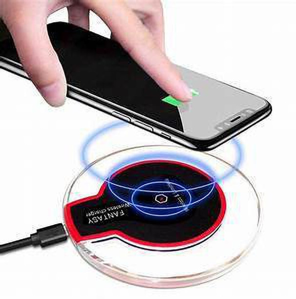
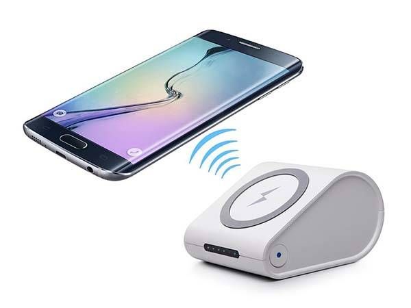
After gaining access to a 3D printer, I decided to assemble a Qi charger with my own hands. In this tutorial, we will make a stylish wireless phone charger that is powerful enough to quickly charge modern smartphones and will respond to them by glowing LEDs.
Step 1: Model
The case was designed in Autodesk Fusion 360 and 3D printed. The top and bottom parts were printed in gray rubber, while the central part was unpainted. nine0004
Step 2: Printing
In order for the surface of the parts to be even, they were all printed at an angle. After printing was completed, all the supports were carefully detached.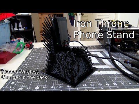 A little polishing brought the details to perfection. All the parts captured in the pictures above have just come out of the printer and have not yet been processed.
Important note: as you can see in the photo above, the wall of the lower part is broken. This did not happen when printing on a printer, it just could not withstand the load during assembly. nine0004
Step 3: Electronics
The most important part of our device is the wireless charger. I bought my PCB on eBay. There are three main characteristics when choosing a charging board:
- The charger must be Qi compatible. Qi technology is a near-universal standard that should charge almost all smartphones that support wireless charging.
- Three coils are much better than one. Most cheap chargers have only one coil that transmits electromagnetic energy to the phone. This greatly reduces the charging speed and also reduces the range of the charger
- Charging indicator light. When the phone is charging from the coils, the indicator is on.
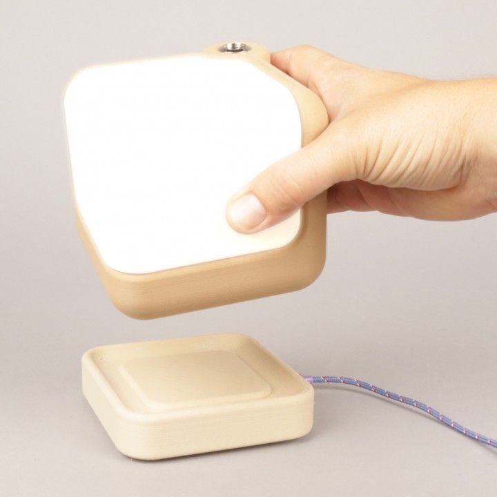 In this project, we will introduce LED elements that will light up and go out while the phone is charging.
Charging circuits are rated for 5V, while the LED strips run on 12V. To use both together, I purchased a converter that took the 12V input down to 5V. The body of the converter was larger than the specification stated, so I had to get rid of the body by covering the water sensitive areas with epoxy. nine0004
For the lighting effect I used a blue 12V diode strip. The width of the diode strip must be small enough to fit into the gap, the width of which is equal to the central part of the package printed in transparent rubber.
You will also need capacitors, transistors, resistors, relays, circuit boards or breadboards, and miscellaneous items.
Step 4: Relay/Transistor
My charging circuit contains two different types of backlight. When the phone is not charging, a current of 1.3V is applied to the red LEDs. When charging starts, the current rises to 3V, "lighting up" the blue diodes. This works great for me, as the transistors act as switches at similar current levels. To provide an audible alarm when the phone is charging, I also added a relay that makes a nice "click" when the current turns on or off. To control all the electronics, I created an unusual circuit that connected both circuits - a charging indication circuit and a 12V power supply. nine0004
Due to the fact that the current in the backlight circuit varies, I have the option of attaching a relay directly to the positive and negative terminals.
Step 5: LED Circuit
I don't have much circuit design experience so my circuit is not the best but it works well. Diode fading circuitry is very simple and is used to minimize the hardness of the on-to-off transition. When the voltage is applied, the brightness of the diodes quickly increases, and when the current is turned off, the diodes slowly go out and it looks very beautiful. nine0004
After making sure the circuit worked, I soldered it on the PCB. After checking the functionality, I cut the board to the size that fits in my case.
Step 6: Assembly
Once all circuits are connected, assembly is easy. The only hard thing is getting all the electronics to fit inside. It's like putting together a puzzle. The charging coils fit well into their slot. To supply electricity, I had to drill a hole in the wall of the case. To protect the device from short circuits, all exposed electronics were isolated. The 12 volt power supply was connected through a hole in the wall and held tight enough to not think about gluing it. When everything is checked for functionality, glue all the modules to the case to prevent displacement. nine0004
Step 7: Finished product
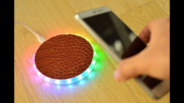
Homemade wireless charger works and I'm very happy with how it looks.
Step 8: 3D CAD models
All model dimensions are in inches.
Files
- ChargeTop.stl
- ClearCharge.stl
- PlateBottom.
 stl
stl
Font adaptive cutlery collection combines aesthetics and accessibility
Australian studio Hop Design used 3D printing to create a set of flatware called Font that can be adapted for people with a variety of disabilities while maintaining a strong and cohesive aesthetic. nine0004
Named for its typographic look, the Font cutlery collection was shortlisted for the Dezeen Awards 2022 in the Home Furnishing Design category. It consists of 24 different sets and can potentially be customized.
Hop Design founder Michael Hoppe created cutlery with the idea of making everyone feel involved at the dining table.
Different shapes of cutlery designed to solve different mobility problems. nine0004
“Cutlery solutions for people with disabilities can have an orthopedic look and feel “different” when sitting next to regular cutlery,” Hoppe said. "We're aiming to change that."
Minimalist cutlery features exaggeratedly rounded handles, knife blades, spoon bowls and fork legs. These characteristics make it seem like a single collection, even with all the other variations.
Some items that tend to change in the collection are the thickness of the handles and the angles between handles and food utensils. nine0004
The Font collection of cutlery is designed to make everyone feel involved at the dining table.
Hoppe has designed kits for people with varying levels of hand strength, dexterity and control - abilities that can be reduced due to age, injury, arthritis, or congenital problems, among other reasons.
Since there is no one-size-fits-all solution for such a wide range of needs, Hoppe used 3D printing to create highly specialized and custom options in consultation with end users and occupational therapists. nine0004
3D printed polyamide handles and stainless steel metal parts. Colors and finishes can be easily changed.
“I wanted a simple aesthetic that would make it easier to create a visual family, while still allowing for a lot of shape variation,” Hoppe said to Dezeen.